Revamp Of Pitstop Pages

WHO THEY ARE
Rocket Mortgage is the largest mortgage lender in America, making home ownership dreams a reality for millions. It revolutionized the industry by introducing the world's first online mortgage experience. Offering simplicity and convenience, Rocket Mortgage is the preferred choice for refinancing or purchasing a home.
Rocket’s approach focuses on creating a personalized home buying experience for each client, ensuring that their specific financing goals are met with certainty. Backed by award-winning service and innovative digital platforms, we empower our clients to make informed decisions quickly and efficiently.
WHAT IS A PITSTOP
In the Rocket Mortgage application process, we require a substantial amount of information from our clients to facilitate their home refinancing or purchase. Occasionally, we encounter situations where we need to temporarily pause their application in order to obtain additional necessary information. This temporary pause in the digital mortgage application is known as a "pitstop."
TEAM
2 UX Writers | 3 UX Designers | 2 Product Managers | UX Researcher
I worked alongside UX designers, web and mobile engineers, the product team, and a content designers to revamp these pitstop pages. We successfully designed it to be accessible on mobile devices, desktop computers, and tablets.
MY ROLE
DURATION
IMPACT
2 Months
Status: Pitstop pages handed over to developers to build.
TARGET USERS
Clients who want to Refinance their homes
Clients who want to Purchase homes.
SUCCESS METRIX
Increase client allocation from 63% ➡️ 73%.
Lower abandonment rate by 10%
Increase client engagement to bankers by 6%
PROJECT GOALS
Set clearer next steps and benefits for clients who want to connect with a banker and move their application forward. Increase conversion as we potentially are putting more clients in the hands of our bankers to assist.
USER PROBLEMS
Unclear content on current pitstop page
Currently we give them little to no reason on why they have been pitstopped in refinance or purchase applications
Clients get frustrated due to this unexpected pause.
Confusion among clients about the next steps when encountered with a pitstop page
BUSINESS PROBLEMS
Today 25% of clients are getting pitstopped in their application
Rocket has 81 unique pitstop pages in the Rocket Mortgage Application.
With each client having their own unique needs, Rocket cannot personalize every pitstop page.
RESEARCH OBJECTIVES
Investigate the correlation between pitstops and client expectations of the mortgage experience.
Identify the essential content required on various pitstop pages to meet client needs effectively.
Explore the level of client receptiveness to banker interaction following a pitstop.
Determine the preferred actions clients would like to take when presented with a pitstop page.
RESEARCH METHODOLOGY
Our team, along with our UX Researcher, conducted User Interviews to gain valuable insights. We recruited 5 clients through Usertesting.com: 3 interested in refinancing and 2 looking to purchase homes. We also interviewed Bankers to understand client responses to Rocket Mortgage Application contact. These interviews totaled over 200 hours.
We presented interviewees with a Figma prototype, letting them interact with current pitstop pages for refinancing and home purchase scenarios.
AFFINITY CLUSTERING:
Our UX team used Affinity Clustering as our research method and took screenshots of the current pitstop pages for Purchase and refinance application. By doing so we were able to theme these pages based on commonality.
We collaborated on designing a self-made template on figjam from our developers’s git files and added pitstop content from these files.
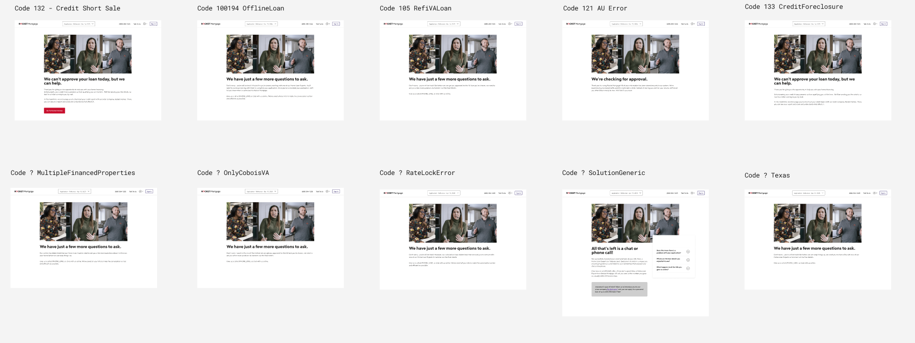
PREVIOUS PITSTOP PAGES

RESEARCH INSIGHTS
Users want clearer explanations for Rocket Mortgage Application rejections.
Simplicity and understandability in content are crucial for users.
Visualizations can enhance the understanding of information.
Users desire suggested next steps for addressing denial reasons.
Clients want guidance on how to resolve denial reasons.
Improve clarity in pitstop page images.
Make the denial screen less discouraging.
SOLUTIONS
Using a self-made template and Dev's Git file with pitstop content, we redesigned the pages in Figma.
Our UX researcher tested the current pitstops with clients to validate assumptions.
Users preferred pitstops specific to their stoppage reasons, while product/dev partners wanted general content to reduce pitstop tracking.
We compromised by creating general buckets and specific pages for high-traffic, low-converting pitstops.
Testing our design and content changes with users confirmed their effectiveness to the product team.
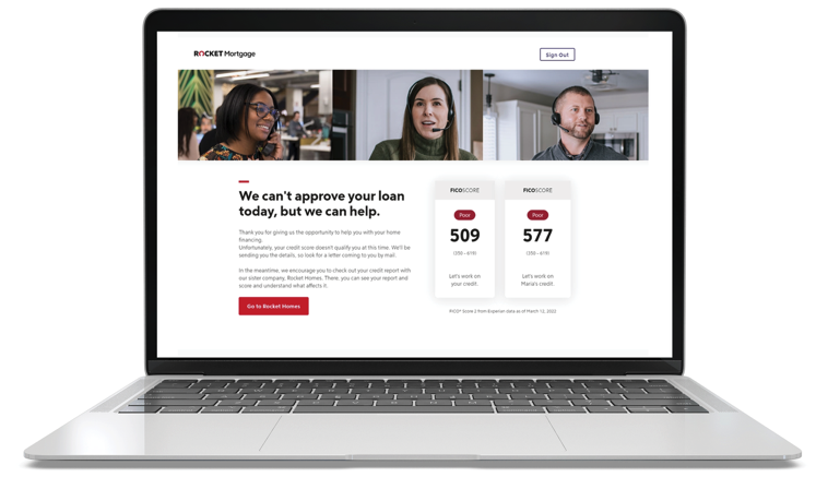
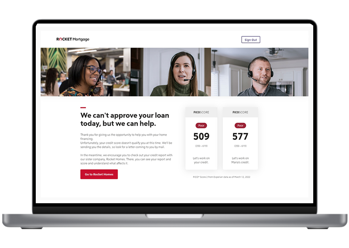
From 81 pitstop pages, we consolidated to 10 different buckets, some of them are:
Credit (but not denial)
Credit Freeze
System Error (Tech Issues)
Self Submit
Need more info
DTI Limit too high
Credit Denial (credit score is too low)
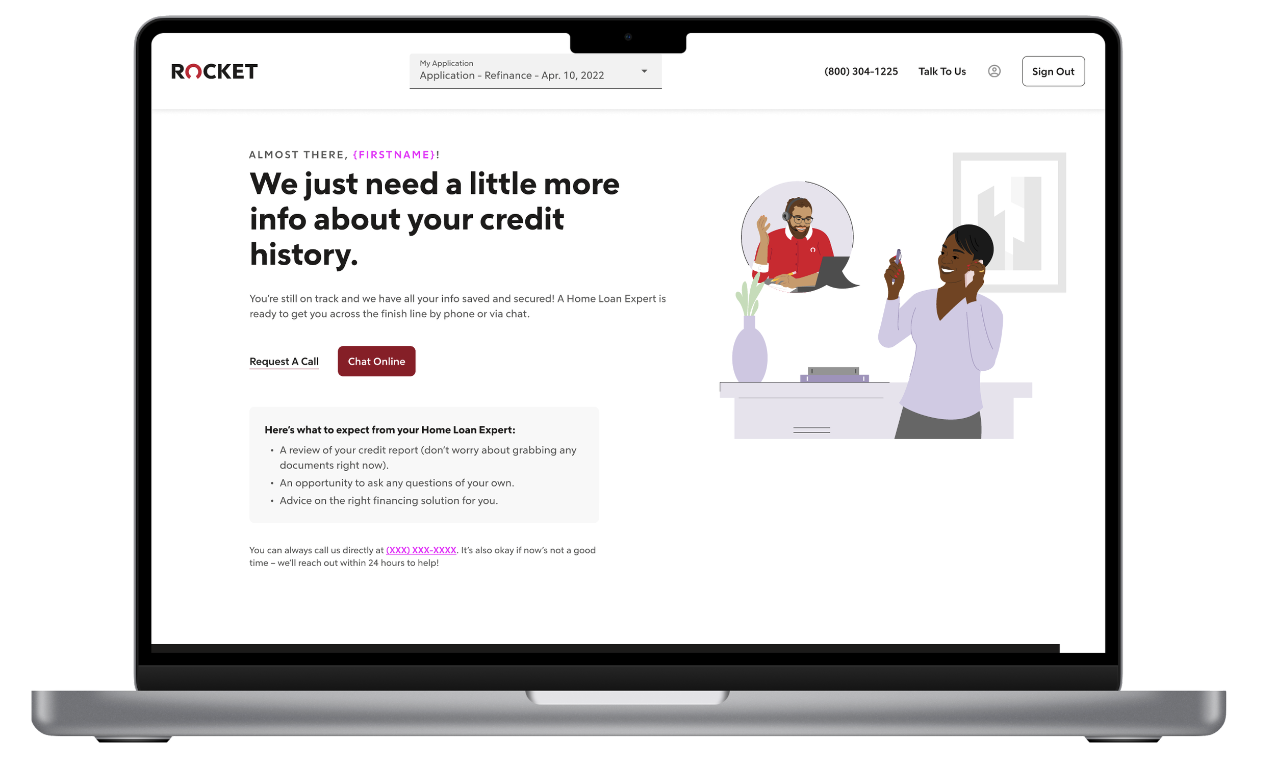
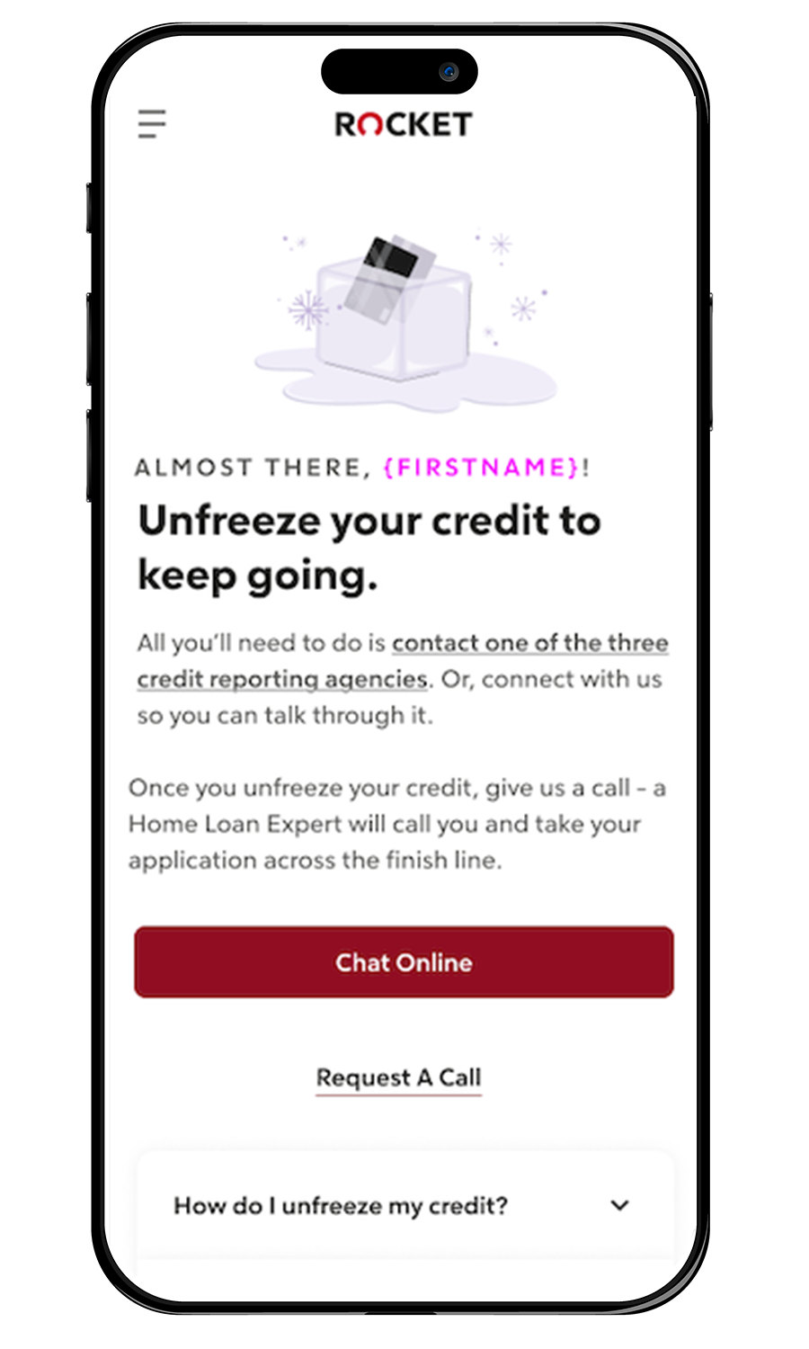
REDESIGN

Unfreeze Credit

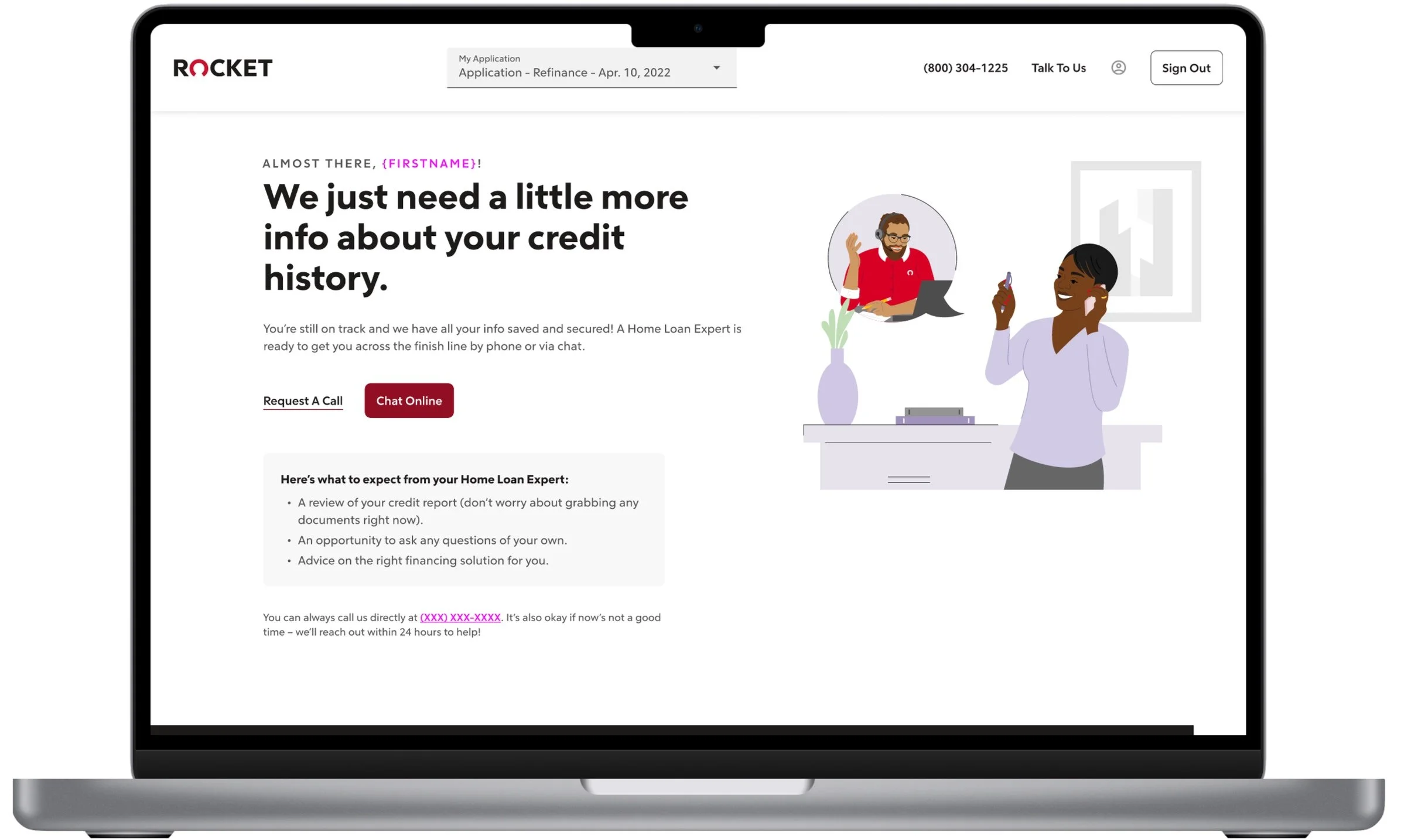
Credit (Not Denial)
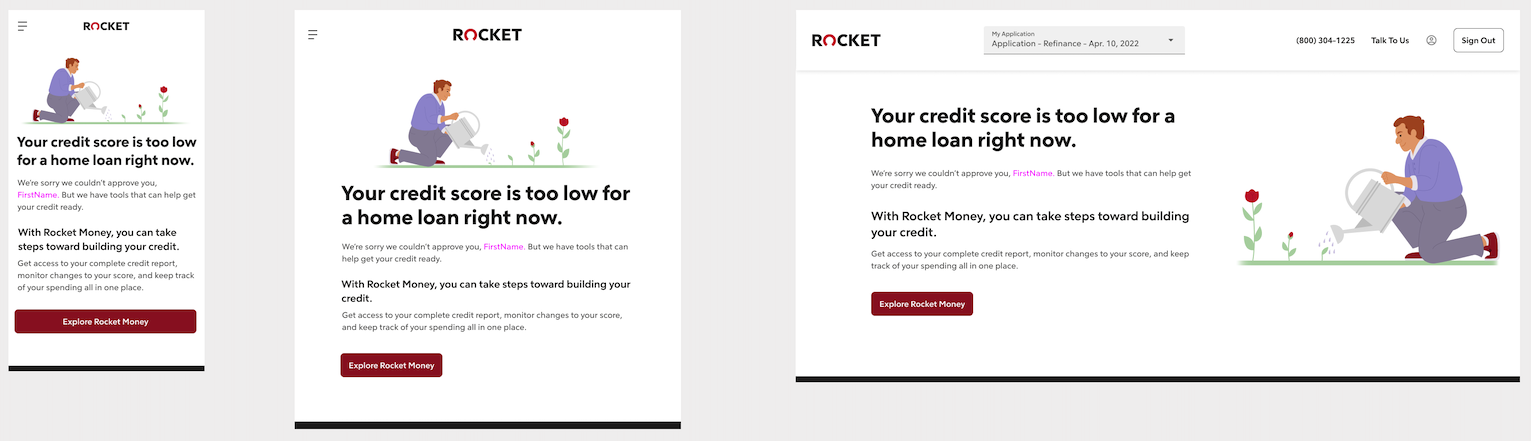
Low Credit Score
REFLECTIONS & CHALLENGES
Design team did not have any visual reference for the pitstops we were replacing
Problem: Despite being an integral part of the RMA experience, the pitstops were never documented in any design file, and it was too tedious to search by URL in Glassbox to screenshot them in action.
Design vs. Product different approaches
Problem: The project was introduced with prescriptive thinking from product/dev partners and it stifled design’s ability to be creative and dig into the problem with fresh(er) eyes.