Identifier First Authentication
PROBLEM STATEMENT
Transforming Rocket Mortgage’s Login into a Scalable, Secure, and Streamlined Experience
Rocket Mortgage’s original login asked users to enter both their email and password on a single screen. While familiar, this flow caused friction, frequent input errors, and lacked flexibility for modern security needs. It wasn’t designed to handle failure states gracefully, and users often felt confused or stuck when something went wrong.
As we migrated to Auth0, we had the opportunity, and the constraint, to redesign the login within a new technical framework. We needed to improve clarity and security without adding complexity.
Our solution was Identifier First Authentication: a two-step login where users first enter their email or username, then their password. This familiar model reduced cognitive load and allowed us to better support edge cases, error handling, and future features like Passkeys and OTP login.
This was more than a UI change. It was a structural redesign of the authentication experience, built for scale and trust.
THE HYPOTHESIS
We believed that by separating the login into two simple steps:identifier first, then password; we could:
Reduce user confusion and login errors
Improve perceived and actual security
Increase overall authentication success rates
Build a modular framework to support future login methods
Reduce support tickets related to login failure
We also hypothesized that a cleaner flow with better messaging could reduce the friction users felt when login issues occurred, especially on edge cases like lockouts and forgotten credentials.
MY ROLE
I led the product design work for this project from end to end. My responsibilities included:
Designing the Identifier First login experience across mobile, web, and desktop
Collaborating with product managers, engineers, and researchers to align business goals, technical constraints, and user needs
Creating modular, scalable UI patterns to support multiple login states, edge cases, and recovery paths
Ensuring WCAG 2.1 AA accessibility compliance
Overseeing visual and content alignment with Rocket’s broader design system
TEAMS
2 UX Researcher
2 Product Manager
Engineering teams across mobile and web
Content design and compliance teams
IMPACT
Designed and launched secure login and signup flows using Auth0, aligned with fintech-grade security standards
Led UX for Rocket’s core authentication platform, including login, account creation, multi-factor authentication (MFA), and admin tools
Supported a user base of 582,000 daily active users and over 40.5 million total accounts
Achieved a 97.8% sign-up success rate through continuous UX refinement
Launched MFA for 27 million users ahead of schedule, increasing protection against identity-based threats by 81%

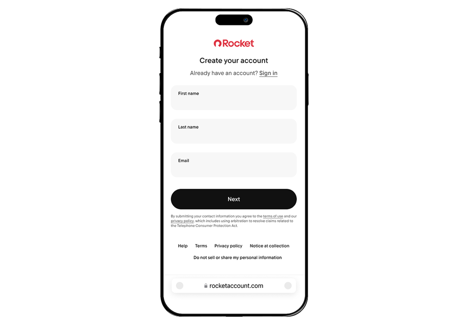
BEFORE REDESIGN » SIGN IN
BEFORE REDESIGN » SIGN UP
RESEARCH AND DISCOVERY
To validate our approach and understand how users felt about login interactions, we used a multi-method research plan:
Unmoderated Usability Testing (40 participants)
Tested early Identifier First prototypes. Most users were familiar with this pattern from other platforms and found it intuitive.
Surveys and Qualitative Feedback
Gathered user preferences around error recovery, tone of voice, and their expectations from a modern login experience. This guided improvements in copy and button labeling.
Moderated Usability Testing (200+ users)
Ran iterative tests on various device sizes to fine-tune the clarity of instructions, button placement, and error messages. This helped us prioritize accessibility, especially on mobile.
GOALS
We defined measurable goals to align the design with both user outcomes and business impact:
Reduce login friction across all devices
Improve authentication success rate
Reduce support volume tied to login issues
Ensure compliance with accessibility standards
Set up a scalable system for future login methods
THE DESIGN
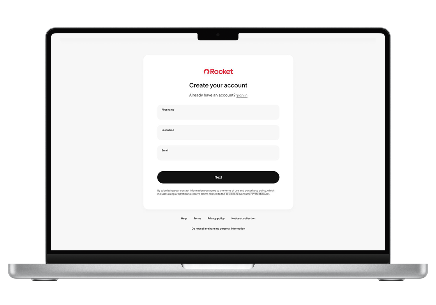
HAPPY PATH - To reduce friction and improve clarity during the login process, we redesigned the experience into a more focused two-step flow:
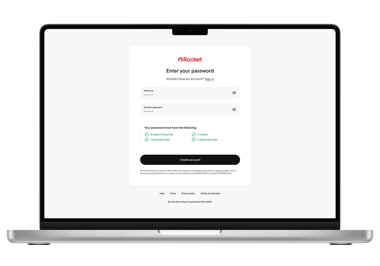
Step 1: Ask for the user's email or username
Step 2: If the input is valid, prompt for the password
This split minimized cognitive load and allowed us to provide more precise, context-aware error messages. For instance, instead of the generic “Invalid credentials,” we could now display targeted feedback like “That email isn’t registered,” helping users course-correct faster and with less frustration.
UNHAPPY PATHS - Error Handling and Edge Cases
We designed three common unhappy paths to ensure a resilient, user-friendly experience.
Invalid email format - User is shown immediate inline error before submission
Unrecognized email — Message: “We couldn’t find an account with that email”
Incorrect password — Message: “Incorrect password. Try again or reset your password”
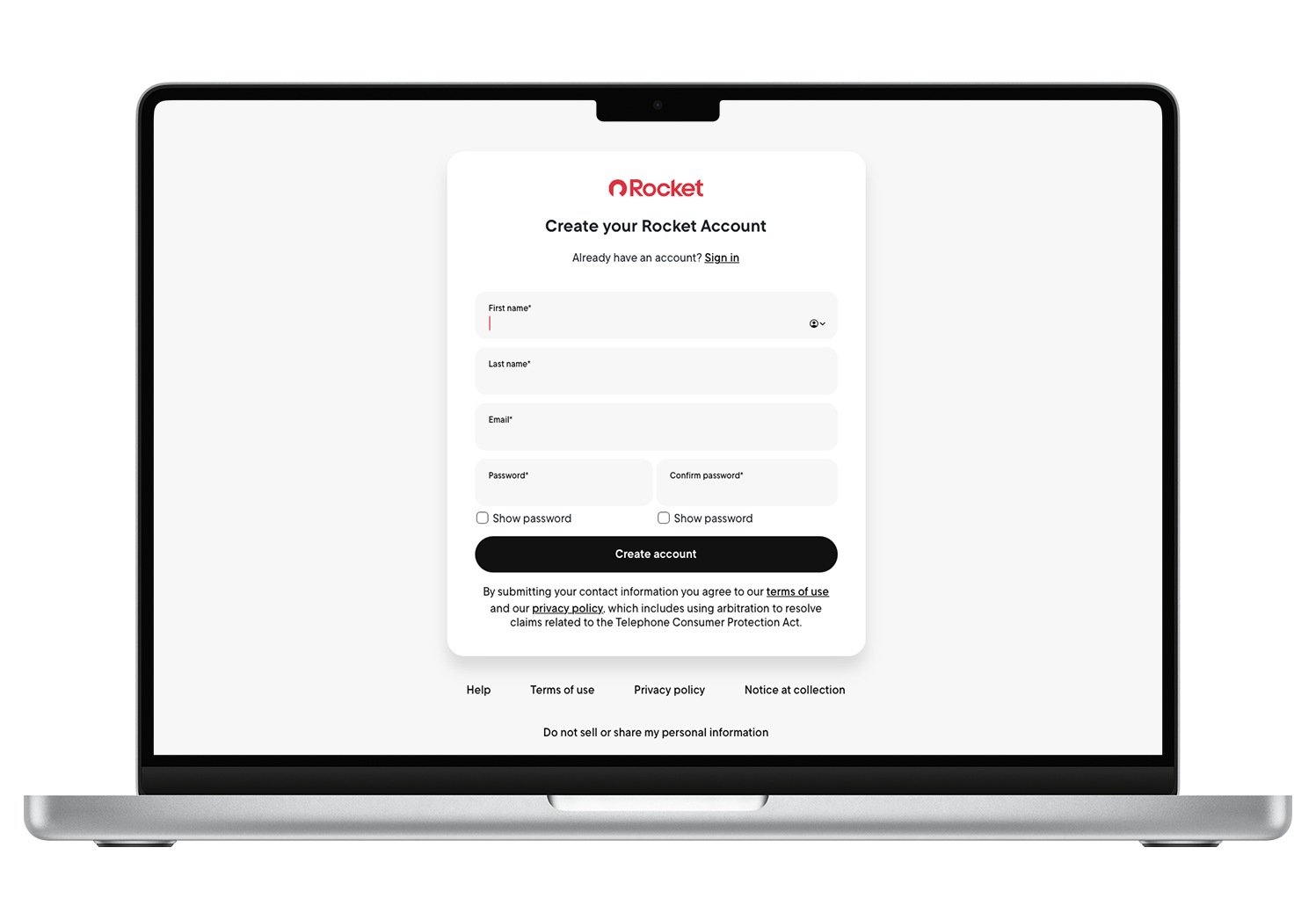
SIGN UP EXPERIENCE
I also redesigned the account creation experience by updating the layout with new Design System components. We replaced the "Show Password" link with an eye icon and introduced a cleaner, more modern version of the password requirements, reducing visual noise and improving overall clarity.
RESULTS AND IMPACT
After launch, we saw immediate and measurable improvements:
Authentication success rate increased to 97.8%, and successfully rolled out to 27 million users ahead of schedule
Identity-based threat protection increased by 81%
Login-related support tickets significantly reduced
Reusable design patterns created for all future Rocket Account login experiences
CHALLENGES
Handling Edge Cases at Scale
Login is one of the most complex UX flows due to the variety of things that can go wrong. We had to create graceful states for each of them—while making the experience feel human, not robotic.
Advocating for Simplicity
Security-heavy products often lean technical. It took strong cross-functional collaboration and user advocacy to ensure clarity and simplicity were prioritized alongside system security.
Lack of Visual Precedents
Because we were migrating to a new architecture with Auth0, many of the existing flows didn’t map cleanly. We had to reimagine the system visually from scratch.
FINAL REFLECTION
What I’m most proud of is how we brought together system-level thinking, user empathy, and future readiness into one cohesive design. This wasn’t just a login screen. It was a gateway to trust. The Identifier First system gave users clarity, gave the business security, and gave our product teams a scalable foundation for the future. It proved that when you get even the smallest moments right, you build the kind of confidence that users carry with them throughout the entire product experience.